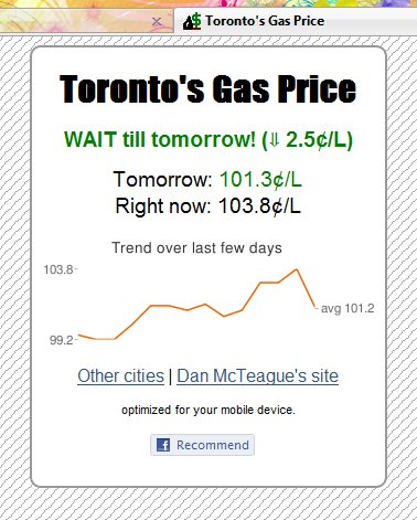
When I made my gas site last year, I put the simplest possible design up there. One reason was because I wanted the design simple for mobile phones, but also because I was kind of lazy in making up a nice design for the site. Well I finally spent some time drawing and fixed it up so it looks a bit more presentable.
The drawback of making it look prettier is that it is not as usable on mobile phones. I hope everyone viewing my site is using a screen that is greater than 320 pixels wide!
I’m especially proud of my favicon (the little icon for the site in the tab). I drew everything pixel by pixel and it actually looks like an oil drop and a dollar sign.
The only real change in functionality is that I enabled a couple of other Canadian cities which I have data for. So if you’re really interested in the Waterloo gas prices, now you know!
 Hi! and welcome to the eclectic personal blog of Kevin Quan. Come in, stay awhile, peek into the nooks & crannies, and learn a bit about me and my interests.